Search the Community
Showing results for tags 'scite font'.
Found 1 result
-
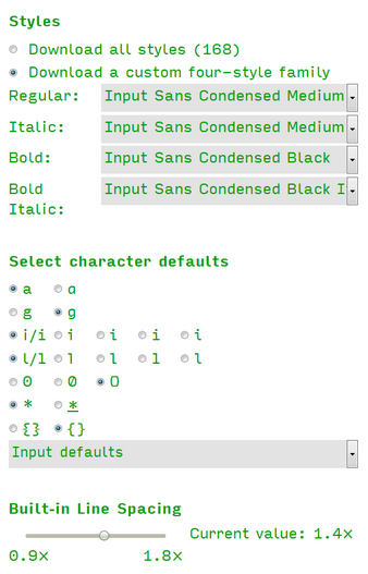
Since the recent SciTE update, I’ve been on a quest to upgrade the appearance (fonts and colors) of my SciTE installation. After viewing several “Best Programming Fonts” articles—and after trying a dozen new fonts—I happened upon something rather amazing: Input, a “free for personal use” font that lets you build your own “family”. With respect to SciTE use, you get to specify exactly which style/weight is deemed as Regular and which is Bold. SciTE is then happy with whatever two choices you make.* For me, it solves the three biggest font problems I’ve had: 1) I like a font that’s slightly heavier, so that it conveys colors well. 2) I’m really particular about the vertical line spacing. “Too sparse” ruins the look, no matter how well-formed the letters are. 3) I’ve never liked squiggly g descenders, which rules out a lot of fonts. I found my perfect solution in a custom 4-style family (see attachment). You can learn all about the font family here: http://input.fontbureau.com/info/ and can test your own preferences here: http://input.fontbureau.com/preview/ Here’s a good review: http://typographica.org/typeface-reviews/input/ ... that includes this: “When it comes to writing and reading code, the user’s preference is paramount and Input offers plenty of ways to hit their sweet spot.” Enjoy. *One minor flaw: the tops of 14-pt 0’s were malformed slightly in SciTE ... but are OK at 13-pt and 15-pt. Likely, it’s something in the way SciTE makes its font calls. 14-pt seems to work OK in a full word processor program.